

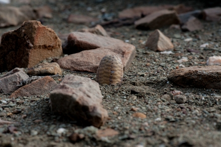
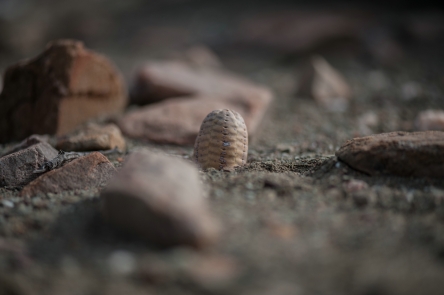
As a rule I use a diaphragm of f/16 when photographing plants, because it usually gives the best combination of sharpness and Depth of Field. After taking this picture of Euphorbia pseudoglobosa last Sunday, I wondered what the result would be if I used the lens’s full opening. The result is shown below. Both pictures have their merits, but to me the second one is more interesting as it imparts a brooding atmosphere and a feeling of loneliness. I would be interested to hear your opinion.
Whenever I travel around with other people looking for plants and photographing them, I ‘m surprised by the speed with which they take pictures. Apparently there is something wrong with me and my equipment. By the time I have made up my mind whether a specific plant is worth a picture and have set up my gear, they are already moving on. And to be honest, often their results are not too bad either. So why would someone go for a time consuming and cumbersome approach when things can be done so much quicker and easier? Maybe we can find an answer when we look at other areas. Why would one take the trouble of cooking a proper meal, rather than grabbing a hamburger or heating up some convenience food? There are a lot of reasons, such as health, taste, atmosphere, variety, cost, the satisfaction of turning a few simple ingredients into something tasty and satisfying. There are probably even more, but you’ll get the drift.
With regard to plant photography we see a similar dichotomy. I think it all depends on the purpose of what you are doing. When you just need something to remind you of where you were and what you saw, there is no need for a beautiful photograph. Some sort of snapshot will do the trick. On the other hand , when you want to show your subject to good advantage, something more (often a lot more) is needed. It is not necessarily a matter of having the best equipment -although that may help. It is much more a matter of attitude towards your subject. You may follow the most common route: point your camera in the right direction, look in the viewfinder or on the display to check if the subject is in the middle and press the shutter. Bingo, another masterpiece. Well, maybe when you are a master, but mere mortals like me –and probably you- have to put a lot more time and effort into making a meaningful picture. By slowing down you give yourself the opportunity to properly look at your subject from different angles and distances. Each change in position will give you a new range of options and opportunities. The nearer you get to the plant, the more of a relationship with it you are building. Especially with small plants I think you have to be within touching distance in order to get a feeling for the plant and its immediate surroundings. Mind you, I’m not a tree hugger, but I’m sure that when you are able to really relate to the plant, looking it in the eye so to say, your pictures will become so much better. In other words, objective observation is not enough; without some emotion, be it admiration, pity, wonder or enjoyment, your picture will at best be a record, a documentation. Nothing wrong with that as such –but there is more satisfaction to be gained from combining documentation with emotion. Don’t take my word for it, do yourself a favour and try it out for yourself. Don’t despair when it does not work immediately.
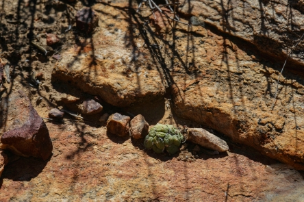
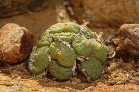
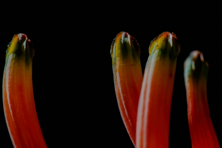
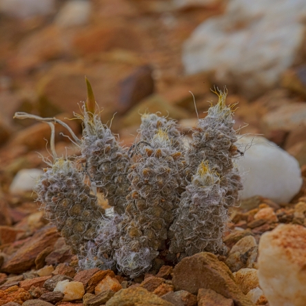
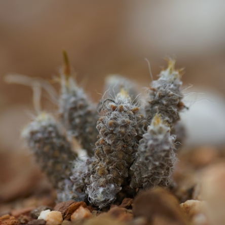
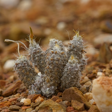
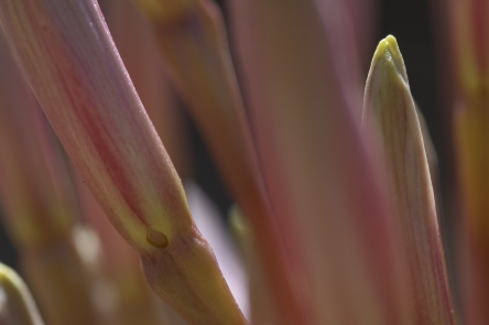
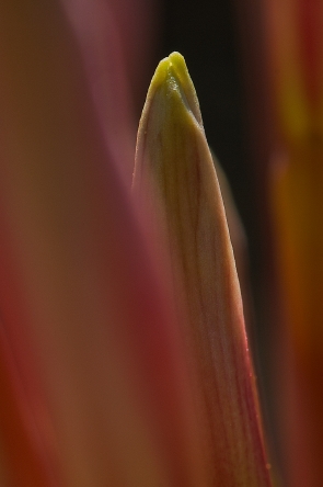
Two pictures of the same plant of Conophytum obcordellum. Which do you prefer?
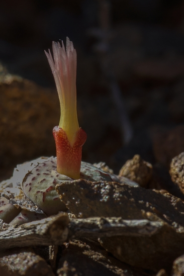
Photographed near Ladismith 17 April 2011.
Nos 1 and 3 were made with ambient light only, in 2 and 4 flash was added. See for yourself what a huge difference in atmosphere this makes.

One of the first things I usually do after starting up my computer in the morning, is checking which new observations there are on the site of iSpot Southern Africa. If you are interested in the flora and fauna of this part of the world, it is well worth having a look at this site ( http://www.ispot.org.za/ ). The quality of the pictures people upload to it is quite diverse, sometimes to a point where it is difficult to even recognize the subject. This is not to say that this site is worse than many others in this respect, it is just that I am so often confronted with the results here.
Judging from the way most people photograph, I strongly believe they do not spend enough time on taking their pictures. Maybe I’m just getting a miserable old git, but I think that it is a waste of time to take pictures when the results become a kind of hit-and-miss thing. Believe me, I’ve been there, done that. Nowadays I’d rather spend 5 minutes on taking one or two worthwhile pictures than 1 minute on taking a whole lot of useless ones. Your mileage may vary of course and I would be interested to hear from you if you have another opinion.
For a bit of more specific advice I refer you to the following text, which is a slightly adapted paragraph from my book on plant photography.
Too many elements in the picture, so that the viewer has to guess what you want to convey.
This cannot usually be remedied afterwards; in some cases cropping the picture help.
For future shots try the following :
1 Get closer.
2 Change angle of view to get different background.
3 Use greater focal length.
Subject not standing out
If there is too little contrast (in colour and/or light) between subject and background, the problem can sometimes be solved in post-production.
If the background is too much in focus there is no way you can improve this picture.
In the future pay extra attention to the background and squint your eyes at the scene to judge the light conditions, before you press the shutter.
Distracting elements in background
This probably means that the Depth of Field (see definition below) is too much.
In certain cases post- production may solve (part of) the problem.
In the future use a shallower DoF (check the scene with the DoF preview button) and/or block distracting elements (esp. bright patches).
Spend more time studying what is in the picture frame.
Depth of field (DoF)
This is the distance over which objects remain acceptably sharp in front of and behind the point on which the lens is focused.
In simple terms: DoF is the part of the scene that appears acceptably sharp in a photograph.
DoF is determined by 3 factors: the focal length, the aperture and the distance between camera and subject.
It decreases as the focal length of the lens becomes greater, the aperture is made bigger and the distance between camera and subject is diminished.
Subject too small in picture space
The picture is taken from too far away or with too short a focal length.
Cropping the picture may offer a solution.
For future shots move in closer or use a longer lens.
Wrong DoF
This means that there is either too much or too little of it, or that it is in the wrong place.
None of these issues can be remedied in an existing picture.
For future shots you should pay more attention to using the right aperture and/or spend more time on focussing properly.
Wrong background (too light or too dark; wrong colour; too cluttered)
Like with so many other problems, the scene was not screened well enough.
Only the first two issues may be improved in post-production (if you are lucky).
Next time spend more time studying the subject before pressing the shutter.
Flare
Light hitting the lens or a filter in front of it is the cause here.
There is no remedy for an existing picture.
For future shots use a lens cap or something else (such as a hand or a hat) to shade the lens.
In some cases flare may add a certain quality to the picture, so instead of avoiding it you may also try to put it to good use.
Main subject too dark or too bright
This occurs when the contrast in brightness between subject and background is too big.
It may be corrected (partly) in post- production.
To avoid this problem next time, use a smaller aperture for a light subject against a dark background and vice versa.
Picture blurred
Unfortunately there is no remedy for this issue.
When the whole picture looks fuzzy, this is caused by camera movement. Avoid this next time by using a tripod and possibly also a cable release or a self-timer delay.
When only part of the shot is blurred, the probable cause is wind. This can be prevented by using a shorter shutter speed.
Contrast in picture too high
When the difference between light and dark elements is too big for the sensor to cope with, this will be the result.
It may be corrected (partly) in post- production.
With smallish subjects, use of a diffuser and/or reflector may avoid this problem. Flash might also help.
Parts of subject damaged, discoloured etc
This happens amazingly often when not enough attention is paid to the subject matter.
In some cases the offending parts may be cropped out, but it is much better to look for unblemished subject matter next time. Continue reading Troubleshooting common mistakes and problems in plant photography
Today’s post is the first in what is intended to become a daily posting of one or more interesting and beautiful pictures (mainly) of succulent plants. The text will be kept to a minimum, so as not to distract from the images. These post will be an addition to, not a replacement for, the usual ones.
You may also notice that I have added a photo gallery to the blog. Enjoy!
We kick off with two pictures that are identical, except for the fact that one was taken with a diffusor. That one seemingly little difference produces quite a different result. One can not really say that one picture is better than the other, but they give different information and also evoke a different feeling. When the light is harsh like in this case, it is worth taking a couple of pictures with and without a diffusor or reflector.
It keeps amazing me how sometimes you decide to do something and you end up with a totally different thing from what you had in mind. This post is a case in point.
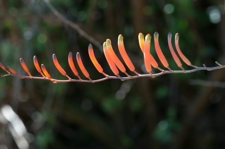
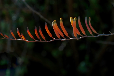
I thought it would be a good idea to write a post on a certain aspect of plant photography that is often neglected (paralleling the subject) and went out into the garden to take some pictures to illustrate the principle. As it happened, there was a nice specimen of Poellnitzia in flower that seemed to fit the bill. Because the inflorescence in these plants is rather long and thin, even the gentle breeze that was blowing made it almost impossible to make a sharp picture. Quite a while ago I bought a gadget especially for occasions like this, where you have to stabilise something that is moving in the wind. It is called a Plamp (plant clamp) and has a couple of other uses as well. Although I rarely (have to) use it, it may make the difference between a good picture and a bad one (or none at all). Have a look at http://www.tripodhead.com/products/plamp-main.cfm for more info.
Even after the inflorescence as such had now been stabilised, the individual flowers were slightly moving in the wind. This defeated the object of showing the differences in depth of field as a result of different camera angles. After the rigmarole of setting up camera, tripod and Plamp, combined with the fact that a flowering plant of this species is not a common sight, I was rather reluctant to just pack up and leave. So I decided to have another look at what was there. As usual, I started with a couple of what my friend Neil Curry, a retired filmmaker, uses to call establishing shots, showing the subject in its environment.
The background was nice and dark but because I did not compensate for its darkness this is how the picture turned out.
This is what it looked like after taking a second picture with one stop underexposure and some fiddling in post production. You will notice that I also removed some of the nasty light blotches in the background.
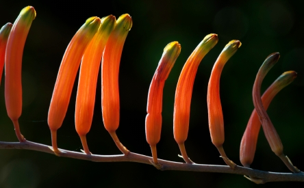
After this, I went somewhat closer up and photographed only the middle part of the inflorescence.
Because the tips of the flowers have a unique shape I decided to make a picture of those at natural size. The flowers are so special in fact, that a whole genus (Poellnitzia) was established to accommodate just one species (rubriflora).
The plant itself is similar in shape to species in related genera (Aloe, Astroloba, Haworthia) but the colour is rather special.
“Our looking is perfected every day-but we see less and less. Never has it been more urgent to speak of SEEING. Onlookers we are, spectators…”subjects” we are, that look at “objects”. Quickly we stick labels on all that is, labels that stick once – and for all. By these labels we recognize everything but no longer SEE anything. We know the labels on all the bottles, but never taste the wine. “
Frederick Franck, The Zen of Seeing
“You learn to see by practice. It’s just like playing tennis, you get better the more you play. The more you look around at things, the more you see. The more you photograph, the more you realize what can be photographed and what can’t be photographed. You just have to keep doing it.”
Eliot Porter
When we want to take our photography to a higher level, we must learn to observe better. It is not about visiting exciting places and having wonderful subjects in front of us.
Even in the most ordinary places you may find something of interest. It has little to do with the things you see and everything with the way you see them. The more carefully you observe things, the better your pictures will become. You can only really learn how to do this when you are able to relax. As long as your mind is filled with worries and concerns, you are occupied with yourself and not with the things you want to see. Therefore, you must try to clear your mind. Unfortunately, this is easier said than done. A good start would be reading Jon Kabat-Zinn’s inspiring book “Wherever You Go, There You Are”.
Once you know how to relax, you can go on to the second step: paying attention to something or somebody.
As Freeman Patterson says in one of his books: “The trick is to learn how to switch yourself off, so you can switch your subject matter on. You have to “let go”.”
In other words, you must develop an attitude of “relaxed attentiveness”. This sounds like a contradiction in terms, and certainly it is not is easily accomplished. Nevertheless, it is well worth trying to get there.
Mindfulness is another word to refer to this state, in which we are not going anywhere or looking for anything specifically, but are one with what is surrounding us. Once we are able to “switch ourselves off”, we allow the picture to find us, instead of us trying to find the picture.
Most of us seem to suffer from sensory overload nowadays and we cannot pay constant attention to all the stimuli that we are subjected to. It is however possible to tune in to specific ones if they are of sufficient interest to us.
I remember an afternoon during one of the first photo workshops that I attended in South Africa. We stopped somewhere in the mountains near Kamieskroon and within minutes everybody was happily shooting away at rocks, trees, flowers, insects and what not. Everybody except me, that is. I was still busy trying to wind down, to relax, to “get in the mood”. Suddenly I became aware of the enormous variety of subjects and of the many ways people were responding to them: some were on all fours , one or two were lying on their backs looking up into a tree, others were sitting on rocks or in trees looking down, etc, etc. So, if I was the only one not seeing anything worth photographing, it obviously had to do with me and not with a lack of suitable subject matter. As soon as I realised this, the “what should I photograph” spell was broken and I started taking pictures just as happily as all the others.
Often one is so focused on the point of interest in the picture frame, that all the rest is not seen consciously. Apparently, the brain filters out much of the “noise” around us.
Richard Zakia (Perception and Imaging, 1997) describes this as: “We only see a small fraction of what we look at, and more often than not we “level” what we look at rather than “sharpen” it.”
One of the strongest barriers to seeing is categorizing and labeling:
– “why should I take a picture of that, it is only a nasty weed”;
– “no good photographing this flower, it’s not fully open yet”;
– “I don’t know this plant’s name, so there’s no use spending time on it”, etc.
It is only when we can leave this stage behind us that we will really see and realise that even simple, daily things can be very interesting.
As Robert Adams (Beauty in Photography, 1996) puts it: “Bell peppers would seem to be about as limited as any subject matter could be, but in fact how unlimited they are when photographed by Weston.”
Another attitude problem is caused by the “been there, done that” syndrome: you look at something and think: “Well, yes, I have seen this many times before and I do have pictures of it, so why waste time looking at it again”. (Never mind that it is not exactly the same thing; it is a different time of day, another season etc.). It may even be very useful to return to the same subject several times, because this will force you to look at it in new and unusual ways.
We need to have something like the receptiveness of a child looking at a thing for the first time. We can only hope to regain this wonderful innocent vision by breaking away from rigid, conventional ways of seeing and thinking.
A good way to improve your seeing is to look regularly at possible subjects through a small opening cut in a piece of cardboard. The opening should be about 10 x 15 cm (with the same aspect ratio as your viewfinder.
Because drawing sharpens the visual senses, one of the best ways to learn how to see better would be to attend a couple of art classes or study a book on learning how to draw. This may sound strange at first, but when you give it a try, you will find out that it really works. You will not only start looking at things in a different way, but also see things you never saw before.
The above is a somewhat modified chapter of my ebook on plant photography. The rest of this post is devoted to a recent example of looking and seeing “out of the box”.
Last Wednesday our small local photo group had its monthly meeting. All the members had to show a couple of pictures of kitchen implements. Hardly an interesting subject one may think, but its very mundaneness had forced us to look at things in a different way.
Some of the results were quite surprising. The following pictures were part of my contribution : there is no direct relationship with plant photography, but the pictures give you a good idea what can happen if you let go of pre-conceived notions of what things should look like.

A set of cookie cutters
A fork, seen from the side
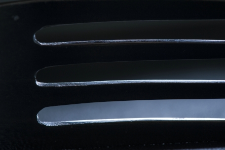
The same fork, seen from above. Lit partly from the back with small flash.
One of the things that people often do not realise when they take plant pictures, is how important the background is. As a result of this, the presence of a sub-optimal or downright bad background is one of the most common mistakes in plant photography.
The significance of a suitable background can hardly be overrated. If you don’t believe me, just look critically at a collection of plant pictures and be (unpleasantly) surprised. On the other hand, a fitting background can do wonders for a picture.
When taking plant pictures outdoors, you should look carefully for distracting objects like branches, grasses, stones etc. in the background. You may have to remove these, but do not forget to replace dead leaves, branches etc. that hide or protect the plant when you are finished. When photographing plants in their habitat, it is usually best to have the background at least slightly out of focus. That is of course, unless you have a good reason to show the plant’s environment.
In photos of cultivated plants we often see labels and rims of pots that ruin an otherwise nice picture. This can often easily be avoided by taking the plant and/or the label out of the pot. When you use artificial backgrounds at home or in the greenhouse, it is a good idea to prepare a couple of them by making prints of out-of-focus photos of leaves, or anything else that looks suitable. For many subjects, a background the size of an A4 sheet will be big enough. Experiment with various backgrounds to see which gives the best results.
Plants or flowers which have light or hairy edges -or are light coloured in general- show up best against a dark background. In the field this can sometimes be arranged by casting a shadow with the help of another person, a camera bag etc. You may also be able to choose a different viewpoint that gives you a dark(er) background. Remember that warm and bright (“dominating”) colours usually are not very effective as a background because they seem to come forward, giving the photo an unbalanced feeling. Even small patches of these colours will draw attention away from the subject.
We tend to see what we expect to see. When we use a dark backdrop behind a light subject, we automatically assume this to result in a nice contrast in the picture.
However, if the dark background is hit by strong light, it will show much lighter in the photo than expected, so that the end result will be far different from what you intended it to be.
Your choice of lens will influence how much background will be visible, so when you have an unsatisfying background (wrong colour, bright spots, unwanted objects), you can often solve this problem by using a longer focal length. Getting closer to the subject might also help.
Your choice of aperture will influence the depth of field (DoF) and thereby the way the background will appear in the final picture. For a variety of reasons we normally use a small aperture in close-up photography. Unfortunately, this often leads to unexpected and undesirable results.
What happens? You look in your viewfinder or at your LCD screen and compose your photo according to what you see there. The moment you press the shutter button, the aperture closes down to the value you have chosen. The smaller the shooting aperture is, the more things inside the photo frame that were blurred (or even invisible) at first, will now come more or less into focus. Especially bright spots that were invisible will come to the fore. This may easily cause havoc to your nicely composed photo.
If your camera has a DoF preview button, you can more or less avoid this problem by pressing the button and looking in the viewfinder to try and see what happens. Unfortunately, the viewfinder will darken proportionally to the aperture chosen and it is therefore often very difficult to judge the result, but at least you will get some idea. When you start with full aperture and close down gradually while looking through the viewfinder, your eye has time to get accustomed to the darkening image.A background should be just that: something behind the main subject, separating it from the rest of the world. And remember: If you can fill the frame completely with the subject, you will not need a background at all!
To sum up: the best background is the one you do not notice (unless it gives specific information that you want to show).
After taking this picture I had second thoughts about the white stones in the background.
I decided to use a bigger aperture, to get a shallower depth of field. Now that the stones in the background were out of focus, they turned out to be more disturbing than the ones in the first picture. In addition to this, too little of the plant was now in focus.
The aesthetic problem was solved here by temporarily removing the bigger stones. Unfortunately, by doing so, information about the environment in which this Anacampseros grows was also removed.
In cases like this, it is best to take a couple of different pictures, to choose from for different purposes later on.
A nice example of how not to take plant pictures. About the only thing that is all right, is the fact that the main subject is in focus.
Even the use of a simple sheet of coloured paper as a background gives an enormous improvement. Not that it is a great picture: The lower part of the plant is ugly, the background is not a nice colour and the fold in the piece of paper is distracting.
But look what a bit of cropping can do. The colour of the background still leaves room for improvement however.

The background here is the same sheet of paper as in the preceding picture, but because it is in the shade, the colour is much more agreeable.
Red and other dominating colours seem to come forward, thereby “compressing” and overwhelming the subject.
For today’s post I choose one of the picture stories that are part of my e-book “Plant photography; from theory to practice” (have a look at my website www.noltee.com).
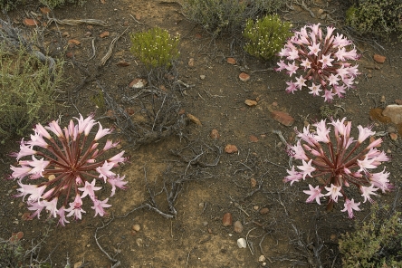
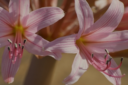
The species of Brunsvigia that is pictured here (B. bosmaniae), is widespread in western South Africa. The common name is maartlelie (March lily), although it may also flower in April and May. When we had our farm in the southwest corner of the Great Karoo, we regularly encountered plants and dry inflorescences of these bulbous plants in the veld. Because we did not got there often during the hot summer months, it took us three years however before we saw the plants in flower. And what a delightful sight it was! Smaller and bigger groups of plants -sometimes dozens of them- colouring the otherwise dry landscape with big bright patches of pink. When I had a closer look at the flowers I decided to try and record some of the thoughts that flashed through my mind while photographing these wonderful subjects. What follows is the result of that process.
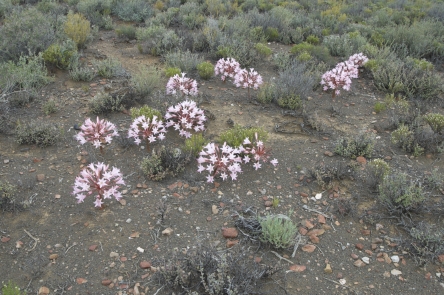
1 This is how I first saw the plants as part of the landscape, growing in their natural surroundings. If that is what you want to record, the picture does what it should do, especially when it is part of a series. Visually, however, something is lacking.
2 By going a bit closer and photographing 3 inflorescences from above, I got a completely different picture. The composition is now much less spontaneous and perhaps even a bit formal.
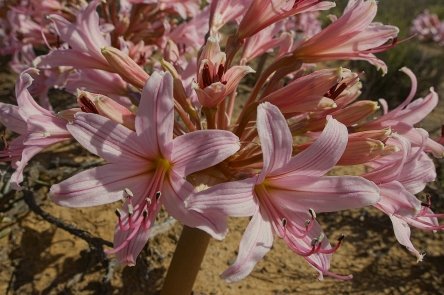
3 When you look at only one inflorescence, it becomes clearer what the individual flowers look like and how they are arranged. Although there are many flowers vying for attention, the picture is held together by the flower stalks all leading to a central point.
4 Although getting closer often makes for a stronger image, in this case it works counterproductive. As there is no dominant point of interest, the photo looks jumbled.
5 Slightly raising the camera and then tilting it down, resulted in a much improved picture, with clear lines all leading to the centre of the inflorescence.
6 Compared to what happened in 4, getting closer really helps here, because the flowers are more or less in the same plane and all the rest is out of focus.
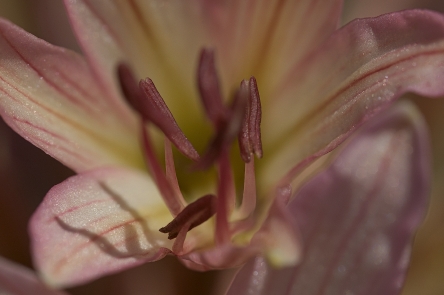
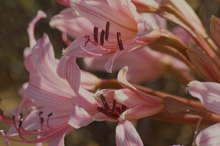
7 It would be interesting to get a good picture of the stamens with their dark colour. Although I used an aperture of only f/6, the petals are enough in focus to draw the attention away from the stamens. Because of that, it is unclear what the message of the picture is.
8 Now the concept is somewhat better, but the execution is still bad. As only one stamen is in focus, the picture is completely out of balance.
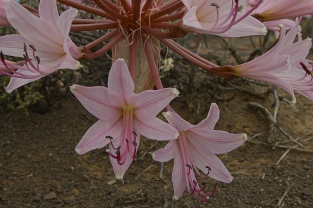
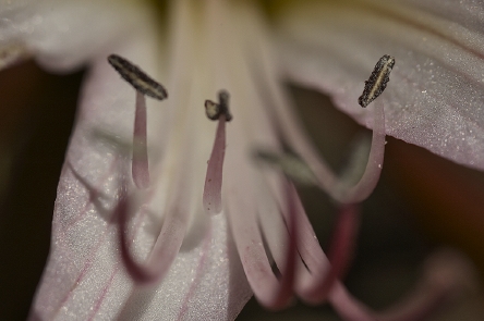
9 Here most of the stamens are well defined, in focus and standing out against an unobtrusive background.
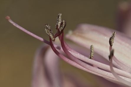
10 Because of their prettiness, flowers have a habit of drawing all attention to them, so that other parts of the plant tend to be ignored. Often it pays to resist that call and see what else of interest is there. Here we are looking at the buds and although the photo is not great, it gives the feeling that something beautiful is hiding in there.
11 After cropping and a bit of playing around with light and colour, this is the result I got. Botanically it is of little use, because it is quite hard to identify if you have not seen the preceding pictures.
Visually however, this is what I would call “an image with attitude”.
* * * * *