The role of the background in plant photography; always important, often neglected

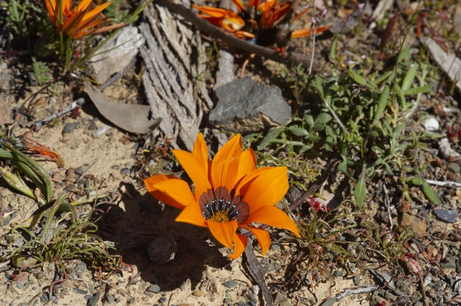
One of the things that people often do not realise when they take plant pictures, is how important the background is. As a result of this, the presence of a sub-optimal or downright bad background is  one of the most common mistakes in plant photography.
The significance of a suitable background can hardly be overrated. If you don’t believe me, just look critically at a collection of plant pictures and be (unpleasantly) surprised. On the other hand, a fitting background can do wonders for a picture.

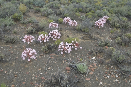
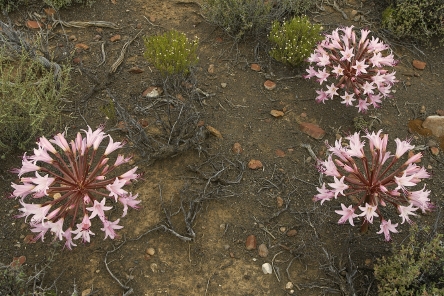
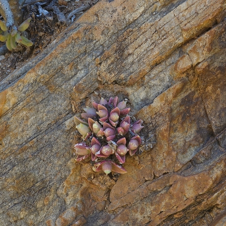
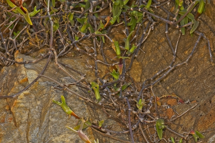
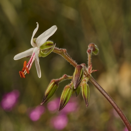
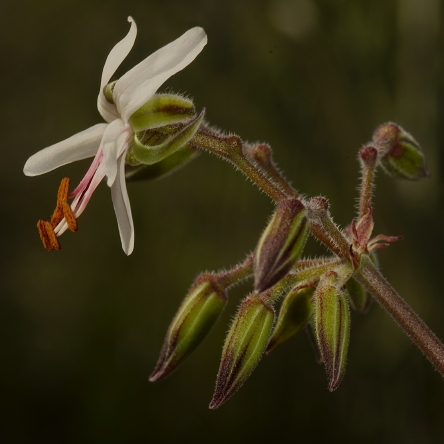
When taking plant pictures outdoors, you should look carefully for distracting objects like branches, grasses, stones etc. in the background. You may have to remove these, but do not forget to replace dead leaves, branches etc. that hide or protect the plant when you are finished. When photographing plants in their habitat, it is usually best to have the background at least slightly out of focus. That is of course, unless you have a good reason to show the plant’s environment.
In photos of cultivated plants we often see labels and rims of pots that ruin an otherwise nice picture. This can often easily be avoided by taking the plant and/or the label out of the pot. When you use artificial backgrounds at home or in the greenhouse, it is a good idea to prepare a couple of them by making prints of out-of-focus photos of leaves, or anything else that looks suitable. For many subjects, a background the size of an A4 sheet will be big enough. Experiment with various backgrounds to see which gives the best results.

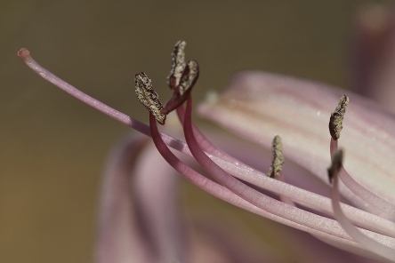
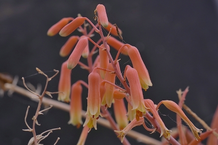
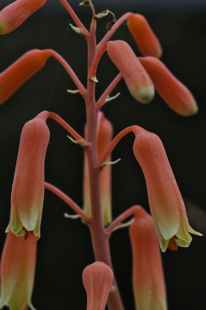
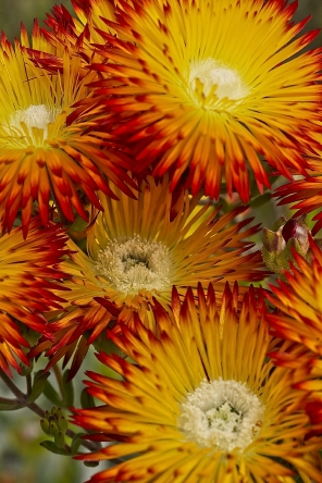
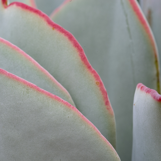
Plants or flowers which have light or hairy edges -or are light coloured in general- show up best against a dark background. In the field this can sometimes be arranged by casting a shadow with the help of another person, a camera bag etc. You may also be able to choose a different viewpoint that gives you a dark(er) background. Remember that warm and bright (“dominating”) colours usually are not very effective as a background because they seem to come forward, giving the photo an unbalanced feeling. Even small patches of these colours will draw attention away from the subject.

We tend to see what we expect to see. When we use a dark backdrop behind a light subject, we automatically assume this to result in a nice contrast in the picture.
However, if the dark background is hit by strong light, it will show much lighter in the photo than expected, so that the end result will be far different from what you intended it to be.

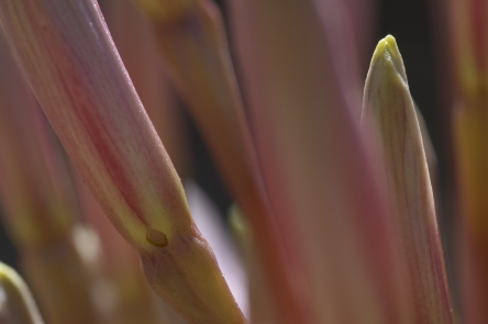
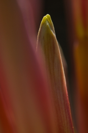
Your choice of lens will influence how much background will be visible, so when you have an unsatisfying background (wrong colour, bright spots, unwanted objects), you can often solve this problem by using a longer focal length. Getting closer to the subject might also help.
Your choice of aperture will influence the depth of field (DoF) and thereby the way the background will appear in the final picture. For a variety of reasons we normally use a small aperture in close-up photography. Unfortunately, this often leads to unexpected and undesirable results.
What happens? You look in your viewfinder or at your LCD screen and compose your photo according to what you see there. The moment you press the shutter button, the aperture closes down to the value you have chosen. The smaller the shooting aperture is, the more things inside the photo frame that were blurred (or even invisible) at first, will now come more or less into focus. Especially bright spots that were invisible will come to the fore. This may easily cause havoc to your nicely composed photo.
If your camera has a DoF preview button, you can more or less avoid this problem by pressing the button and looking in the viewfinder to try and see what happens. Unfortunately, the viewfinder will darken proportionally to the aperture chosen and it is therefore often very difficult to judge the result, but at least you will get some idea. When you start with full aperture and close down gradually while looking through the viewfinder, your eye has time to get accustomed to the darkening image.A background should be just that: something behind the main subject, separating it from the rest of the world. And remember: If you can fill the frame completely with the subject, you will not need a background at all!

To sum up: the best background is the one you do not notice (unless it gives specific information that you want to show).

_DSC0615_lzn1res
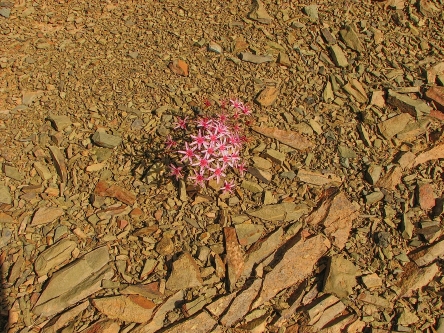
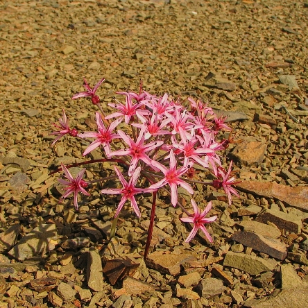
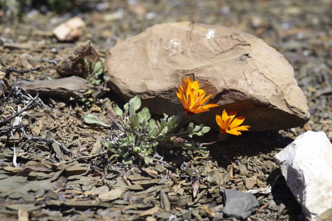
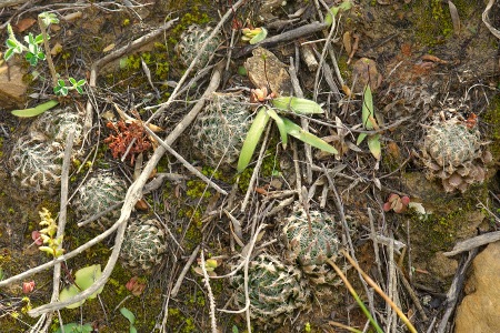
After taking this picture I had second thoughts about the white stones in the background.

_DSC0616res
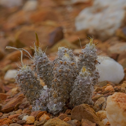
I decided to use a bigger aperture, to get a shallower depth of field. Now that the stones in the background were out of focus, they turned out to be more disturbing than the ones in the first picture. In addition to this, too little of the plant was now in focus.

_DSC0617_lzn1res
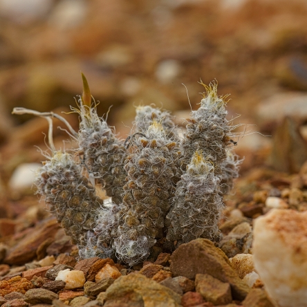
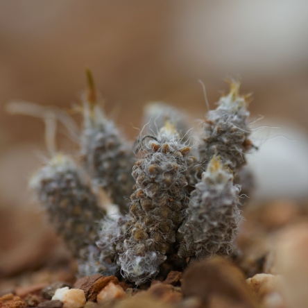
The aesthetic problem was solved here by temporarily removing the bigger stones. Unfortunately, by doing so, information about the environment in which this  Anacampseros grows was also removed.
In cases like this, it is best to take a couple of different pictures, to choose from for  different purposes later on.

2011_01_20#021res
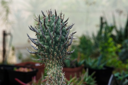
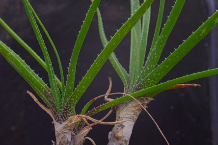
A nice example of how not to take plant pictures. About the only thing that is all right, is the fact that the main subject is in focus.

2011_01_20#022res
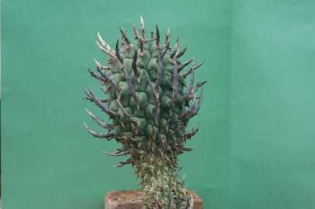
Even the use of a simple sheet of coloured paper as a background gives an enormous improvement. Not that it is a great picture: The lower part of the plant is ugly, the  background is not a nice colour and the fold in the piece of paper is distracting.

2011_01_20#023res
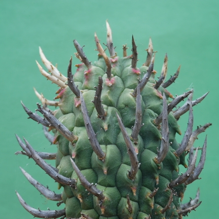
But look what a bit of cropping can do. The colour of the background still leaves room for improvement however.

2011_01_20#024res
The background here is the same sheet of paper as in the preceding picture, but because it is in the shade, the colour is much more agreeable. 

2011_01_20#025res
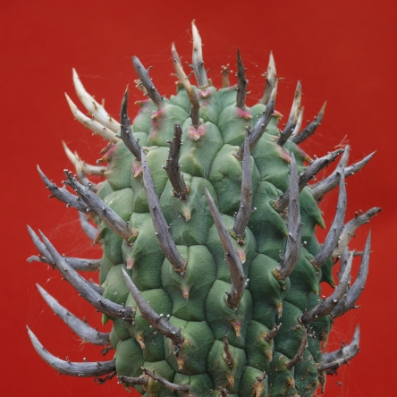
Red and other dominating colours seem to come forward, thereby “compressing” and overwhelming the subject.

Another picture story (Brunsvigia)

For today’s post I choose one of the picture stories that are part of my e-book “Plant photography; from theory to practice” (have a look at my website www.noltee.com).

The species of Brunsvigia that is pictured here (B. bosmaniae), is widespread in western South Africa. The common name is maartlelie (March lily), although it may also flower in April and May. When we had our farm in the southwest corner of the Great Karoo, we regularly encountered plants and dry inflorescences of these bulbous plants in the veld. Because we did not got there often during the hot summer months, it took us three years however before we saw the plants in flower. And what a delightful sight it was! Smaller and bigger groups of plants -sometimes dozens of them- colouring the otherwise dry landscape with big bright patches of pink. When I had a closer look at the flowers I decided to try and record some of the thoughts that flashed through my mind while photographing these wonderful subjects. What follows is the result of that process.

brunsbosmDSC_4618res
1 This is how I first saw the plants as part of the landscape, growing in their natural surroundings. If that is what you want to record, the picture does what it should do, especially when it is part of a series. Visually, however, something is lacking.

brunbosmDSC_4624_lzn1res
2 By going a bit closer and photographing 3 inflorescences from above, I got a completely different picture. The composition is now much less spontaneous and perhaps even a bit formal.

brunbosmDSC_4594_lzn1res
3 When you look at only one inflorescence, it becomes clearer what the individual flowers look like and how they are arranged. Although there are many flowers vying for attention, the picture is held together by the flower stalks all leading to a central point.

brunbosmDSC_4587_lzn1res
4 Although getting closer often makes for a stronger image, in this case it works counterproductive. As there is no dominant point of interest, the photo looks jumbled.

brunbosmDSC_4622_lzn1res
5 Slightly raising the camera and then tilting it down, resulted in a much improved picture, with clear lines all leading to the centre of the inflorescence.

brunbosmDSC_4590_lzn1res
6 Compared to what happened in 4, getting closer really helps here, because the flowers are more or less in the same plane and all the rest is out of focus.

brunbosmDSC_4653_lzn1res
7 It would be interesting to get a good picture of the stamens with their dark colour. Although I used an aperture of only f/6, the petals are enough in focus to draw the attention away from the stamens. Because of that, it is unclear what the message of the picture is.

brunbosmDSC_4655_lznres
8 Now the concept is somewhat better, but the execution is still bad. As only one stamen is in focus, the picture is completely out of balance.

brunbosmDSC_4663_lznres
9 Here most of the stamens are well defined, in focus and standing out against an unobtrusive background.

brunbosmDSC_4640res
10 Because of their prettiness, flowers have a habit of drawing all attention to them, so that other parts of the plant tend to be ignored. Often it pays to resist that call and see what else of interest is there. Here we are looking at the buds and although the photo is not great, it gives the feeling that something beautiful is hiding in there.

brunbosmDSC_4640_lznres
11 After cropping and a bit of playing around with light and colour, this is the result I got. Botanically it is of little use, because it is quite hard to identify if you have not seen the preceding pictures.
Visually however, this is what I would call “an image with attitude”.

* * * * *

Making simple pictures

The word simple has many meanings, but the ones I have in mind here describe qualities such as clear, clean, uncluttered,  not complicated or consisting of  only essential things.
Striving for these qualities may well be the most important way to get better photos. Andreas Feininger put it this way: “The simpler and more direct, the clearer and stronger the statement”.
The problem is that many of us tend to include as much as possible in the picture, so that the viewer easily gets confused, because there is no clear message. When there are fewer elements competing for attention, your picture will usually be a lot stronger. The first thing you have to do is decide what the main point of interest in the scene is. Then you must find out if there are any competing ones. If this is the case you must determine whether the image would become weaker or stronger by including these.  You may be able to do this on the spot, but it often easier to take a couple of different shots and select the best ones later on.  If you take pictures of plants in the wild, at least some of them should include a fair bit of the environment too.

One way to get a better, less cluttered picture is often to get closer to the subject. As the famous war photographer Robert Capa used to say: “If your pictures aren’t good enough you aren’t close enough”.
By getting closer you simplify the picture, thereby focusing attention on the main subject and getting rid of distracting objects.
Often the picture can also be simplified by limiting the Depth of Field

 hessstelIMG_1188_lznres
This picture gives a good impression of the harsh surroundings  this species of Hessea has to cope with , but visually it is not very appealing

hessstelIMG_1190_lznres
The second picture gives much more information about the flowers, while still showing the plant in its environment

 2011_01_20#053_lzn1res
The first of these 3 pictures gives a good impression of what this species of Aloe looks like, but it is a bit jumbled

2011_01_20#054_lzn1res
For the second picture I cleaned up the plant a bit, by removing remains of old leaves. This gives us a better view of the spotted backs of the leaves, which are so typical for this group of plants. By moving in, we have also got a much stronger picture

2011_01_20#055_lznres
The third image verges on the abstract, but it is still recognizable. Because of that, it is not just visually but also botanically interesting

 greenhouse 043_lznresres
The individual flowers are quite beautiful, but the pictures does not show them to advantage

 greenhouse 048_lznresres
By going nearer I managed to get rid of the unnecessary and disturbing elements

Why do we take pictures?

That’s a bit of a silly question, isn’t it? We take a picture of something  because we want to have a picture of it. That’s all there is to it, or is it?
To get a more useful answer, maybe we should make the question less general: Why  take a picture of a certain plant?
The answer could still be vague: because I like to have a picture of this plant.  As long as that is all you want, fine. As they say: if you don’t mind where you are going, you ain’t lost.
If, on the other hand, you want to make a meaningful picture, your answer will have to be more specific.  You must be able to put into words why exactly you would photograph this plant. Otherwise, the best you can expect is what the famous Ansel Adams used to call “a sharp image of a fuzzy concept”.

The reasons for photographing a plant (or a part of a plant!) may cover an enormous range:
– because I like these flowers
– because I’m writing an article on this species
– because this is the first time I see the plant in the wild/ in this kind of environment/ in this area
– because I want to show the peculiar hairs on the leaves
– because I don’t have a picture of this species yet
– because the fruits remind me of …
– because I want to show the plant in its natural surroundings
– because normally the plant does not flower in this time of the year
– because I don’t know the name of the plant and hopefully the picture  can help me sort it       out
– because the fruits/buds/young leaves look so wonderful
– because I am awed by how this little plant survives in its hostile environment
– because I want to impress people with a picture of this rare plant in my collection
– because the picture will remind me of this wonderful trip
– because……, because……., because…….

Obviously you don’t have to restrict yourself to one reason. Do remember however, that each reason will demand a different approach. You will not be able to show a big  plant as  a whole and a detail of it, at the same time; if you want to show hairs or warts, you will probably need to use side lighting or backlighting, etc.
When you look at the list a bit closer, you will notice that part of the reasons have to do with the subject as such. In that case you will need a documentary, representative approach.  Other reasons have to do with your response to the subject, requiring an impressionistic,  creative approach.  Being aware of all this and responding in a suitable way, is an important step on the way to better pictures.

euphmult2009-06-06_DSC1976_lznres  euphmult2011_04_17#080_lzn-1res
Twice the same species (Euphorbia multiceps), but what a difference in pictures!

huerpill2011_11_25#014_lznres  huerpill_DSC4830_lznres
Huernia pillansii lends itself perfectly for making abstracts pictures

drosbico2011_09_13a#026_lznres  drosbico2011_09_13a#030_lznres
The first picture shows the plant (Drosanthemum bicolor) in its environment,  the second one tells us  much more about the flowers

mitrcliv2011_10_05 e.v.#231_lznres  mitrcliv2011_10_05 e.v.#233_lznres
The first picture shows the juvenile stage of Mitrophyllum clivorum, the second one gives an impression of an adult plant

Quality and direction of light in plant photography

As you probably know, photography means drawing (or writing) with light. Simply said: no light, no photography.  In this post I’ll describe two important  aspects of light:

Quality of light usually refers to its degree of diffusion, i.e. how  harsh or soft it is.
We tend to think that a clear sunny day is ideal for photography. As we will see, in reality it often gives the worst possible lighting, especially for taking plant  pictures.
A direct light source, such as the sun in a clear sky, produces harsh, contrasty light . The highlights and shadows are strong , resulting in big contrasts with abrupt transitions. This hard light also tends to make colours weaker.
Our eyes can cope with this kind of light much better than the camera, so that what looks acceptable in the viewfinder often turns out useless once it is photographed.
When the contrasts between light and dark are too big, many details will be lost, either in shadows or in washed-out areas. You may therefore have to use a diffuser to soften harsh sunlight and/or a reflector to get some light in a dark spot.
Hold the diffuser as close as possible to the subject. If you hold it further away, it will just throw a shadow on it.

clip_image002This picture was taken in harsh sunlight and is therefore very contrasty.
Even after spending quite a bit of time enhancing it in post-production, this was the best result I could get.

clip_image004This photo of the same species was made on a bright, overcast day, giving a much more pleasing result, even without any enhancing.
Using a diffuser on a sunny day would have yielded a similar result.

cotyorbi2011_11_06#014_lzn

cotyorbi2011_11_06#015_lzn
In this pair, the differences are rather more subtle. The first picture was made without doing any special; for the second one  I used a diffuser.
Although I like both of them, the first one reminds me more of the hot and sunny day on which it was made. Therefore it also gives a better idea of the conditions  these plants have to cope with. 

In many cases the sensible and careful use of flashlight may also help. If none of this works, you will have to decide what is more important to you: preventing the highlights from becoming burnt-out or the dark areas from turning completely black. The first option is usually best.
On bright overcast or misty days the light will be soft and diffused, with shadows evenly scattered around the subject. This kind of light produces soft contrasts and is easy to work with. It is very pleasing for photographing flowers. However, sometimes you may have too much of a good thing and end up with light that is too flat. In such a case, it is a good idea to add some shade to a small portion of the picture or alternatively to highlight another part so that it stands out more.
Reflected light is often soft too. Completely overcast days with heavy, dark clouds are not so good for flowers, but may work well for other parts of plants.

Direction of light refers to the camera position with regard to where the light comes from. There are three primary directions of light: front, side, and back. They all have their own characteristics and exert different influences on the mood of an image. Depending on your subject you should try different kinds of lighting to see what effects you like best.

When the light comes from behind you and falls directly on the front of your subject matter, we talk about front lighting. The entire subject is evenly lit and the shadows mostly fall behind the subject, so that this often appears lacking in volume and texture. In close-up photography this type of light also may cause problems by the lens or lens shade throwing a shadow on the subject.

Back lighting is the opposite: the light comes from behind your subject matter; it emphasises shadows and outlines shapes strongly.

clip_image006Back lighting can produce striking pictures, especially against a dark background

It creates strong contrasts and can produce a bright outline around the subject. Like side lighting it can make the colours of translucent objects sparkle. It is most effective with translucent or strongly coloured leaves or flowers. It may be necessary to underexpose 1-2 stops in order not to overexpose the bright areas; on the other hand it is sometimes advisable to open up 1-2 stops in order to allow detail in the subject. Therefore this is one of the situations where you should bracket your exposures.
Back lighting is not an easy light to work with, but it tends to create a strong mood and can produce images that are hard to ignore. Both side lighting and back lighting normally occur when the sun is low on the horizon (early in the morning or late in the afternoon). When you can photograph a plant from underneath, you may get the back lighting effect at other times of the day as well.

Side lighting is best for showing texture, as it gives the picture a 3-dimensional quality.
There is a clear separation between the light and the dark side of the picture. The shadows produced by side lighting may or may not be useful in composing your picture. Like back lighting it can make the colours of translucent objects sparkle.

clip_image008Because the light is coming from the side, we see not only the tiny dewdrops, but also their shadows on the leaf

Exactly the same, but different; what post-production can do for your pictures.

A couple of months ago my wife and I were travelling to our farm near Matjiesfontein when we decided to have a short coffee break. As usual, I utilized this opportunity to quickly scan the area. Not far from the road I came across a plant of Cotyledon orbiculata (the beautiful form that used to be called undulata).

    cotyorbiorb_DSC7345#2012-02-12res
This picture shows my first attempt of photographing the plant.
It is not a bad photo, but neither does it convey the feeling I got when looking at the subject.

cotyorbiorb_DSC7345#2012-02-12_lznres
After cropping the picture this is what I got. Much better I thought, but too realistic.

cotyorbiorb_DSC7347#2012-02-12_lznres
Cropping in a slightly different way, combined with darkening the picture and enhancing the colours, resulted in this.
It seemed to me I was on the right track, but now the left side of the photo was too busy and distracting.

cotyorbiorb_DSC7349#2012-02-12res
I had also made another picture, almost identical to the first one, but taken from a slightly different angle. When I closely compared the two, it became clear that the second one would be the best starting point for the picture I wanted.

cotyorbiorb_DSC7349#2012-02-12_lznres
I first treated the picture the same way as in number 3 and the lowered the contrast.
This is the end result, realistic enough to be of botanical value, but at the same time visually stimulating.

Tips for making better plant pictures

When one looks at the many plant pictures that can be found on the internet, it quickly becomes clear that there is a lot of room for improvement.

The two most common problems by far are:
–clutter (too many competing elements in the picture). The photographer seems to be saying: “Look, there is so much of interest here that I cannot choose. Please help yourself”
— a disturbing background (too dark or too light, too much in focus, wrong colour etc.)

Once you have become aware of these 2 problems you can take your first steps to better plant pictures.
Other problems one often sees, such as too much or too little contrast, may sometimes be (partly) remedied in post production. For the two main problems, that often is not possible  unfortunately.

Modern cameras can take most decisions on their own. In itself that is a wonderful thing, but we have now reached a stage where it may become counterproductive. In other words, the photographer is lured into thinking that he/she only has to point the camera at the subject and press the button to get a nice picture.
When you decide that maybe your pictures are not as good as you would like them to be, you have to take back some of the decision making into your own hands.
Once you have found a suitable subject, it is a good idea to first take a picture of the plant as a whole. After this you should try to describe to yourself what the subject is and what is so interesting about it. Then include in the picture only what fits this description. Doing all this will force you to slow down and that may sound like a bad thing. The opposite is true however, as a lot of less-than-perfect pictures come about because the photographer is in a hurry.

Image
Both the pink blotches at the bottom and the bright spot on the right draw attention away from the subject.

Image
Simply by changing the camera position slightly, I was able to get this result. Well worth the extra bit of trouble, don;t you agree?

Each time you make a picture you make decisions even if one is not aware of it.
Mentally working through a check-list will make this decision making process easier. In the beginning it will seem like overkill and it may make you feel a bit silly (especially when others are around). But so what? Following these simple steps is bound to result in better pictures and that is what it is all about, isn’t it?

Your check-list could be something like this:
*Is the subject matter at hand the best I can find, or is there something better nearby?
*Will one picture be enough or do I need more to tell the story, maybe one of the whole plant in its environment and some of details?
*Is this a good time of the day/year to take the picture? Should I try to return later, when the flowers are open, the fruits are ripe, the leaves have unfolded etc.?
*Is the light all right or should I rather wait a while or come back later?
*Should the background be in focus, so that it adds information to the picture or out of focus so that the subject stands out more? Are there any unwanted objects/shadows/ highlights in the background? Do I need a different background or foreground?
*Will moving the camera give better results (forward or backward, tilted, raised or lowered)? What if I step or turn left or right?
*Will a different focal length (if available) or focus point create a better picture?
*What will happen if I change the aperture or the shutter speed?
*Are the contrasts in the picture space not too high? Should I use a diffuser or reflector?

After taking the picture, look at the display at the back of your camera to see how the picture has turned out: is the lighting even; is the exposure correct; is the depth of field enough (and in the right place)?

Of course there is much more to making good plant pictures than this, but it may be a good start.
If you want more information on the subject, have a look at my Ebook “Plant and flower photography”

Excerpt from my e-book on plant photography

A short picture story no 1

Image
This is the type of picture that many people would take. One can see how the plants grow in their natural environment and how many flowers they produce, what shape and colour the flowers are etc.

Image
This picture tells us that the same species may also grow in a different situation and it shows the leaves and the back of the flowers.

Image
Here we see the relatively enormous size of the flower and the beautiful markings on it.

So between them, these three pictures are quite informative, and with some cropping their message would become even stronger.
But whatever you do to them, they will still be run-of-the-mill pictures and visually there is not much to return to once you have seen themNow look at the next picture!

Image

Here we are still looking at the same species, but the picture is rather different!
This time we see no open flowers, but the back of an almost mature bud. The dark background makes the petals almost sparkle.

This is a small part of my e-book “Plant and flower photography; from theory to practice”.
For more information have a look at my website www.noltee.com

First post

This is the beginning of a blog that is focused on two topics. Firstly on anything that has to do with succulent plants, especially those growing in South Africa, because that is were I live.
Secondly on photographing plants, succulent or not, cultivated or in the wild.
These two things have kept me busy for many years and I have written and lectured on them for almost as long. I have the privilege of living in an area where interesting succulents grow almost on my doorstep and as I am retired I have lots of time to study and photograph them
.
Haworthia arachnoidea v. nigricans along the road near my home

I hope to provide you regularly with interesting information on these subjects. It would be great to hear from you and learn what you are interested in. Therefore I invite you to share your ideas, questions, comments and opinions with other readers.
If you would like to get some more idea of who I am and what I do, please have a look at my website www.noltee.com.